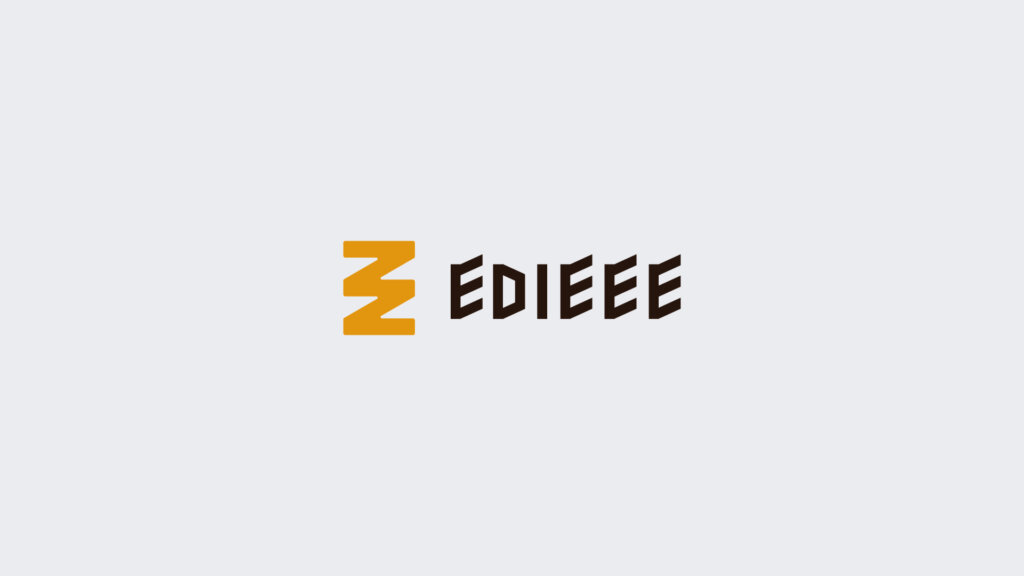
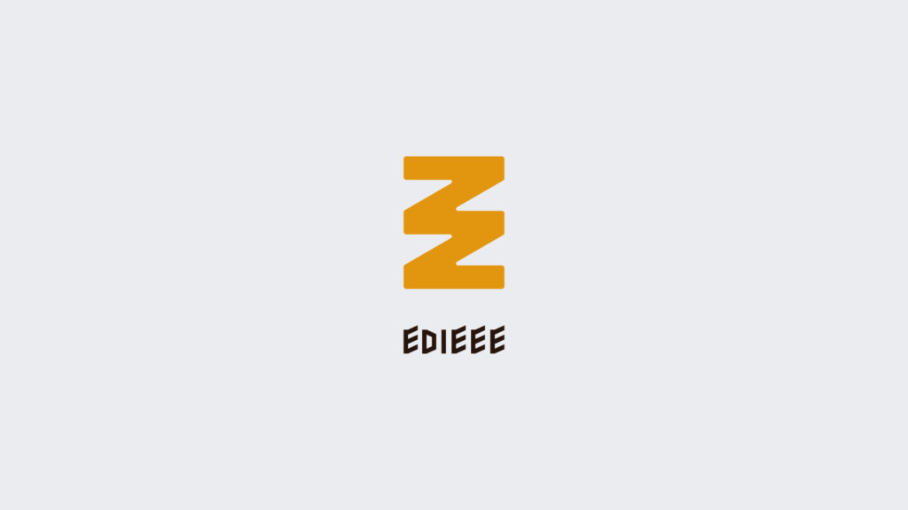
体験を届けるプロジェクトデザインスタジオであるEDIEEE合同会社のロゴを制作させていただきました。
社名にも採用されている「編集」を中心としたコンセプトでお作りしたシンボルで、編む・積む・重ねるという部分の3枚の積み重ねで会社・ひとの経験や体験を厚くしていく事を表現しています。また、螺旋や風をイメージした作りにしており、人を巻き込み・巻き込まれ上昇する様な意味合いも込めています。余白のある「モノ・コト・コンセプト」を生むという点から、白抜きの余白部分に”手”を入れ込んで編集の重ね作業を行っている様にも、会社と顧客が手を取り合っているようにも見え、コンセプトに合った仕上がりを意識してご制作させていただきました。色は黄色・オレンジベースの琥珀(アンバー)色で、100年後も語り継がれる様な事業をという所から、琥珀の様に年月をかけて幾重にも重なって作られる様な所を思い描いて貰えるという点と、編集の基本である書物におけるベーシックな色味の白・黒と相性が良く、引き立て役として重宝される点がとても合うと思います。
–
We created the logo for EDIEEE LLC, a project design studio that delivers experiences.
This symbol was created based on the concept of “editing”, which is also used in the company name, and expresses the accumulation of knitting, stacking, and layering to enrich the experience of the company and people.
In addition, it is made with the image of spirals and wind, and it has the meaning of involving people, getting involved, and rising. From the point of creating a blank space, we created a logo that matches the concept by making the blank part of the logo look like the company and the customer are holding hands.
The color is yellow/orange-based amber. I created logo that I want this company to become a business that will be passed down for 100 years, like amber, over the years.
CLIENT:EDIEEE合同会社 TYPE:ロゴ
Related Projects